Task 2: Display Posts
Step 1: Layout Skeleton
In this step, we will create a layout skeleton for our Posts app using Shad UI components. This will provide a foundation for our app's UI and allow us to easily add functionality and content in future steps.
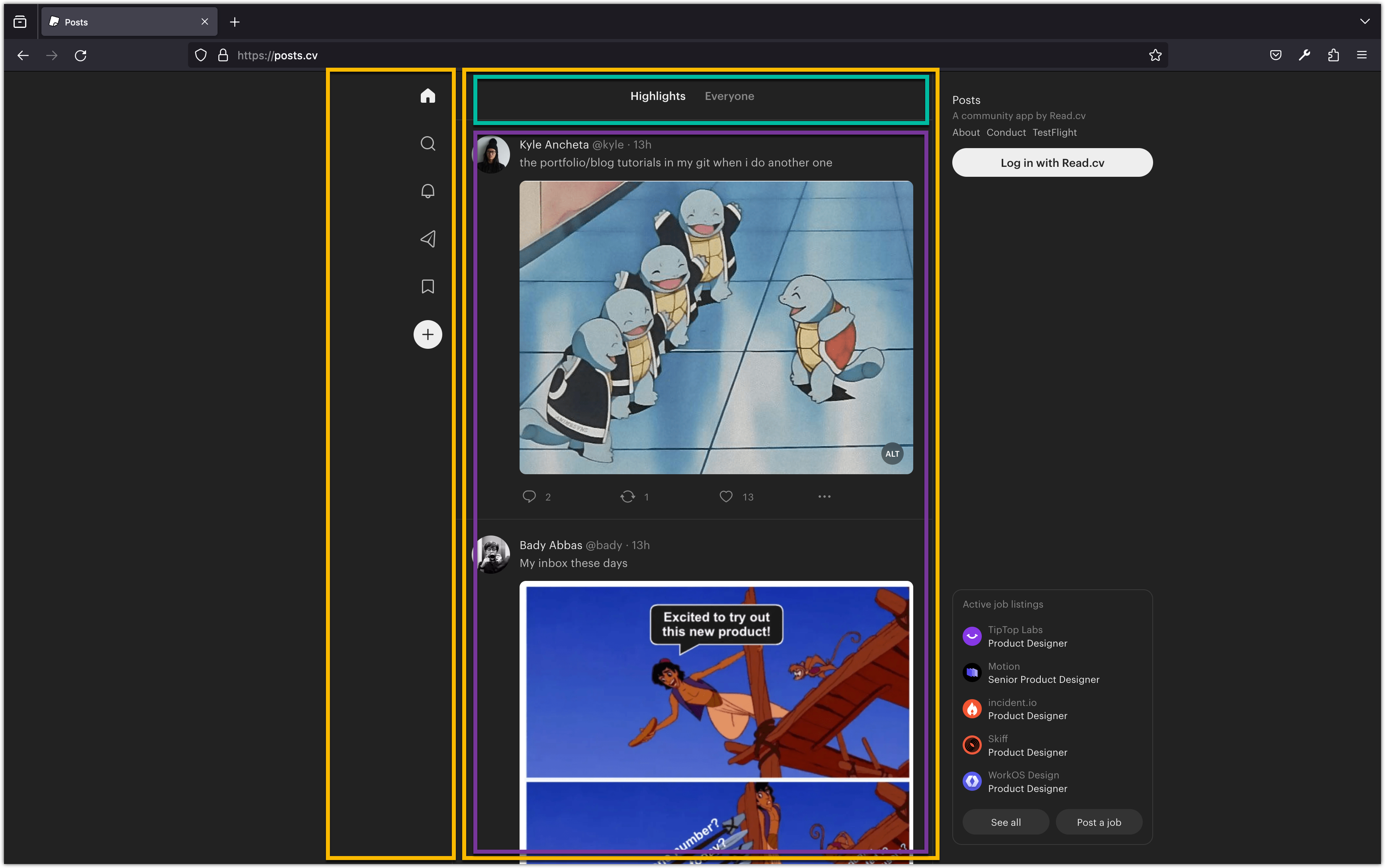
Let's visit https://posts.cv/ and analyze their UI design. You will notice two sidebars on the left and right sides of the screen. The left sidebar contains icons that help with navigating to different routes or features of the Posts app. The right sidebar contains advertising and a login button, but we will ignore it since we don't want to include advertising in our version’s and we haven't implemented user registration and authentication yet.
The middle area is the "feed," which is a scrollable stream of content. The content is displayed in blocks that have a similar appearance and repeat one after another. In this case, the feed consists of posts. The feed section also has a header where you can switch between "Highlights" and "Everyone". This allows for high-level filtering of the posts.
Thinking in Components
"Thinking in components" refers to the ability to break down a user interface into smaller, reusable building blocks called components. Each component represents a specific part or functionality of the UI and can be composed together to create complex interfaces.
In the context of the Posts UI, we can identify several components:
- Sidebar: The left sidebar containing icons for navigation.
- Feed: The scrollable area displaying the posts.
- Header: The section at the top of the feed where the user can switch between "Highlights" and "Everyone".
- Post: The individual blocks of content in the feed.
React encourages the concept of thinking in components. React components are JavaScript functions (or classes) that describe a part of the UI and return HTML (or JSX) to be rendered on a web page.
By breaking down the UI into components, we can achieve several benefits:
- Reusability: Components can be reused in different parts of the application, promoting code efficiency and maintainability.
- Modularity: Components encapsulate their own logic and styling, making it easier to understand and reason about each part of the UI.
- Composability: Components can be composed together to build complex interfaces, enabling a hierarchical and structured approach to UI development.
- Scalability: Components can be individually updated or replaced without affecting the entire UI, allowing for easier scalability and future enhancements.
In the context of the Posts UI, we can implement each component as a separate React component, with its own functionality and styling. This modular approach enables us to easily manage and update different parts of the UI independently.
By thinking in components, we can create a flexible and maintainable UI architecture that promotes code reuse, readability, and extensibility.
Posts Core Components
Add these files to the src/components folder:
-
feed.tsxconst Feed = () => { return <div>feed</div>; }; export default Feed; -
header.tsxconst Header = () => { return <div>header</div>; }; export default Header; -
posts.tsxconst Posts = () => { return <div>posts</div>; }; export default Posts; -
sidebar.tsxconst Sidebar = () => { return <div>sidebar</div>; }; export default Sidebar;
Each component in the code returns a React Element, which is a JavaScript object describing a DOM node (HTML element) and its properties. We use JSX (JavaScript XML) syntax to create these React Elements.
JSX allows us to write HTML-like code within our JavaScript or TypeScript files, making it easier to express the structure and content of our UI components. It is then transpiled into regular JavaScript code by tools like Babel or TypeScript.
For example, in the Feed component, the JSX expression <div>feed</div> is used to create a React Element representing a <div> element with the text content "feed". Similarly, the other components use JSX to create their respective DOM nodes with appropriate content.
By using JSX, we can leverage the full power of JavaScript to dynamically generate and manipulate the UI, while also benefiting from the readability and familiarity of HTML-like syntax.
Update src/App.tsx as follows:
import Sidebar from "./components/sidebar";
import Feed from "./components/feed";

function App() {
  return (
    <div className="flex justify-center min-h-screen">
      <Sidebar />
      <Feed />
    </div>
  );
}

export default App;
In JSX, we can use both HTML elements and React components to build our user interface. Just like HTML elements, React components must always have a closing tag, even if the component doesn't have any children.
For example, in the code snippet provided, we can see the usage of HTML elements like <div> and React components like <Sidebar /> and <Feed />. These components are imported from separate files and used within the JSX code to compose the UI.
When using HTML elements, we can use self-closing tags for elements that don't have any children, such as <div /> or <img src="..." alt="..." />. However, it's important to note that self-closing tags are only valid for HTML elements and certain JSX elements like img or input. For React components, we must always use a closing tag, even if the component doesn't have any children.
This syntax allows us to create a hierarchical structure of components and HTML elements, making it easier to organize and compose our user interface in a modular and reusable manner.
As an aside, please note the following code will not compile:
function App() {
  return (
    <Sidebar />
    <Feed />
  );
}
In React, each component must return a single element. This means that when defining a React component, the JSX expression within the component's function or class must have a single root element.
For example, in the code snippet provided, each React component (Sidebar, Feed, Header, and Posts) returns a single <div> element as the root element. This ensures that the component's JSX expression has a single parent element.
If multiple elements need to be returned, they can be wrapped within a single parent element, such as a <div> or a <React.Fragment> element. This parent element acts as the container for the multiple elements.
By enforcing the rule of returning a single root element, React ensures that the component's structure is clear and that it can be easily managed and manipulated.
Finally, please note when writing multiline JSX code within a component, such as the return statement, it is necessary to wrap the code in parentheses () to ensure proper syntax.
For example, in the App component, the return statement is enclosed in parentheses (). This allows us to write multiple lines of JSX code without encountering syntax errors.
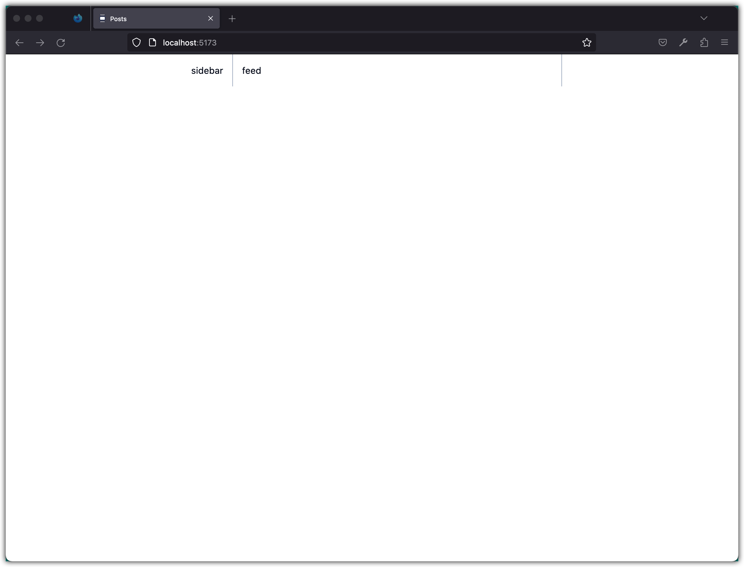
Let’s update the styling of the Sidebar and Feed components:
-
feed.tsxconst Feed = () => { return <div className="flex flex-col w-full h-full p-4 border-x border-slate-400 md:max-w-xl">feed</div>; }; export default Feed; -
sidebar.tsxconst Sidebar = () => { return <div className="p-4">sidebar</div>; }; export default Sidebar;
Run the app and check the UI:
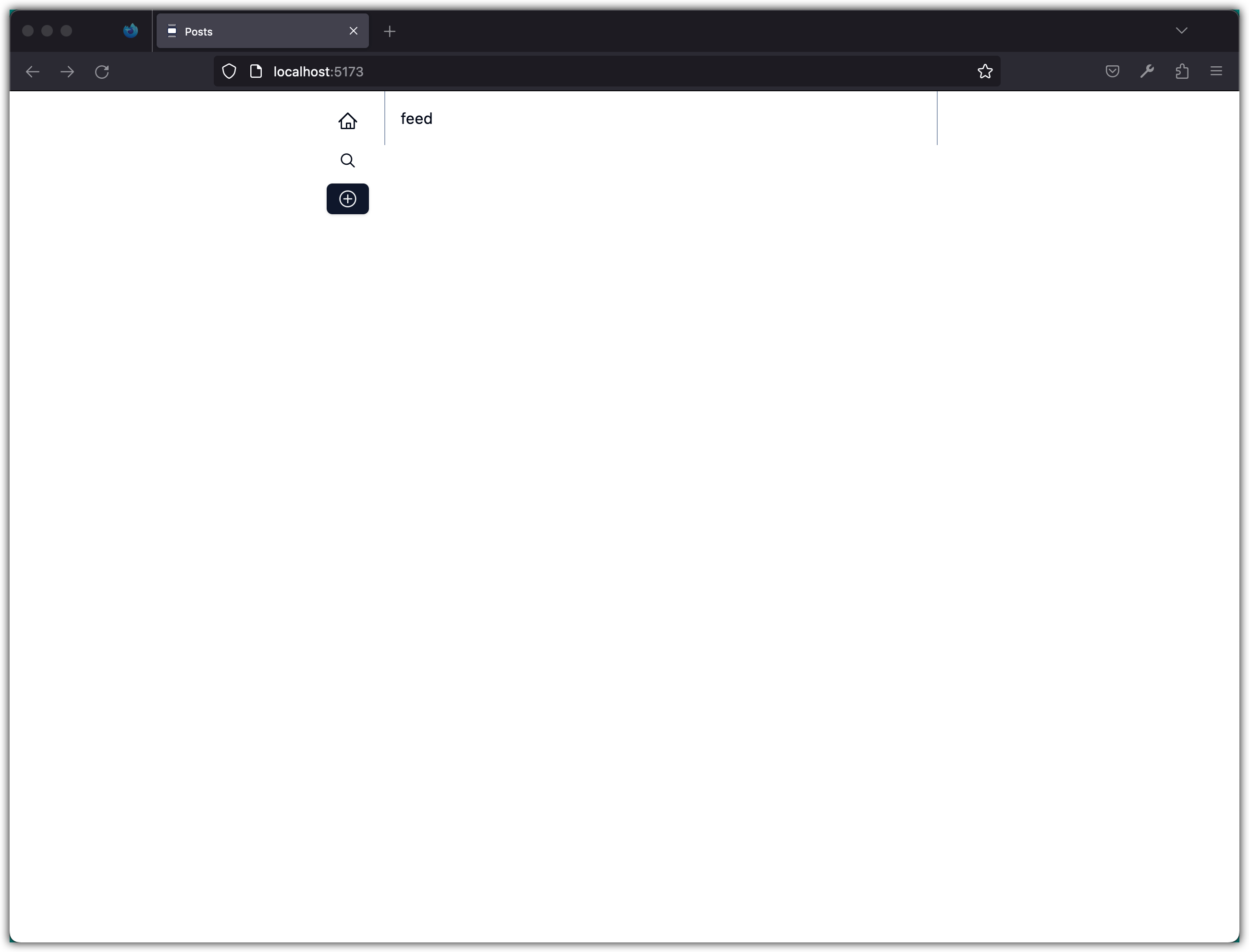
Let’s work on the sidebar:
import {
  HomeIcon,
  MagnifyingGlassIcon,
  PlusCircledIcon,
} from "@radix-ui/react-icons";

import { Button } from "./ui/button";

const Sidebar = () => {
  return (
    <div className="flex flex-col gap-2 p-4">
      <Button aria-label={"Home"} variant="ghost" size="sm">
        <HomeIcon className="w-5 h-5" />
      </Button>
      <Button aria-label={"Search"} variant="ghost" size="sm">
        <MagnifyingGlassIcon className="w-5 h-5" />
      </Button>
      <Button aria-label={"Make a Post"} variant="default" size="sm">
        <PlusCircledIcon className="w-5 h-5" />
      </Button>
    </div>
  );
};

export default Sidebar;
Check the UI:
Let’s work on the Feed component:
import Header from "./header";
import Posts from "./posts";

const Feed = () => {
  return (
    <div className="flex flex-col w-full min-h-screen border-x border-slate-400 md:max-w-xl">
      <Header />
      <Posts />
    </div>
  );
};

export default Feed;
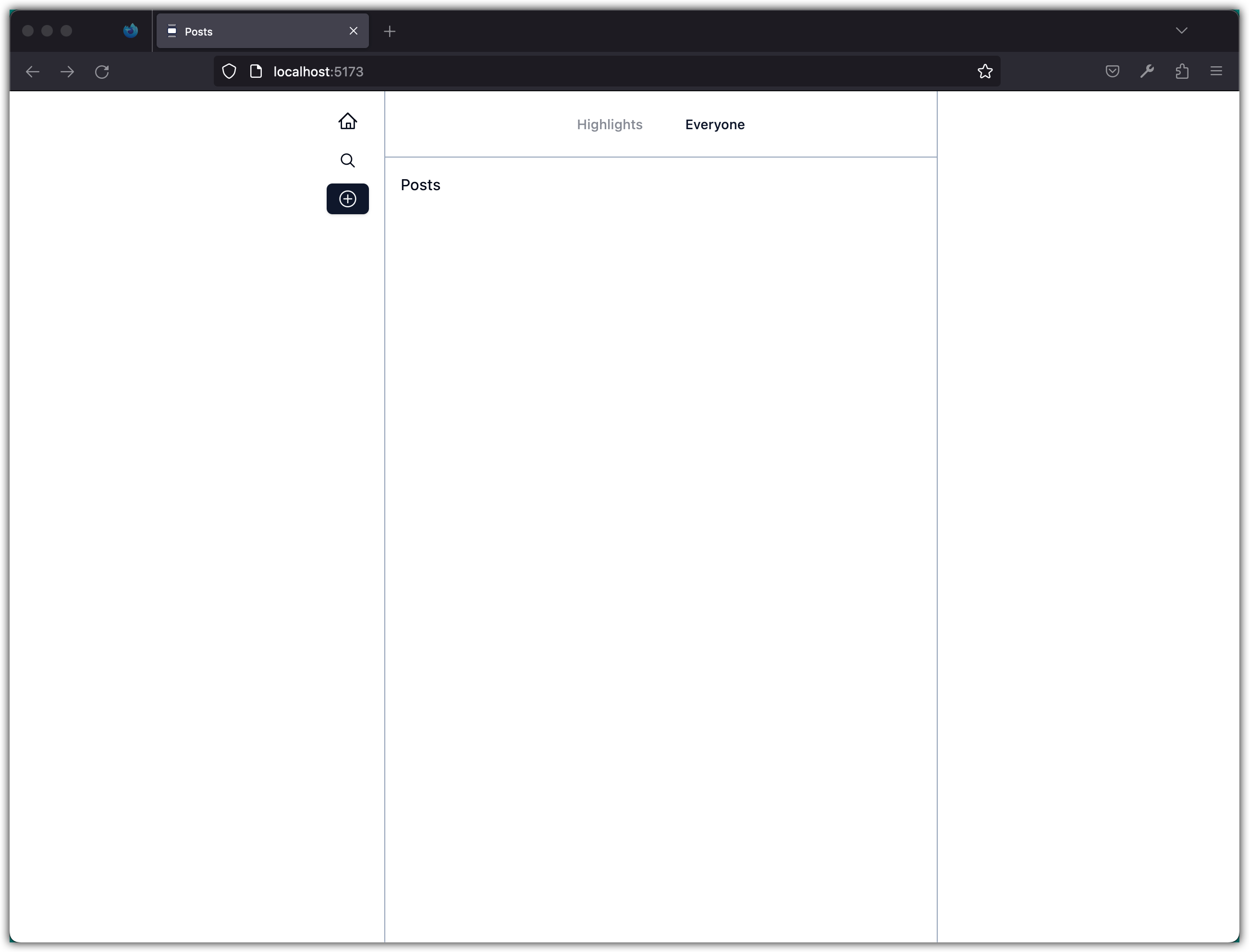
Update the Header component:
import { Button } from "./ui/button";

const Header = () => {
  return (
    <div className="flex justify-center gap-3 p-4 border-b border-slate-400">
      <Button variant={"link"} disabled={true}>
        Highlights
      </Button>
      <Button variant={"link"}>Everyone</Button>
    </div>
  );
};

export default Header;
Update the Posts component:
const Posts = () => {
  return <div className="p-4">Posts</div>;
};

export default Posts;
Check the UI:
Stage and commit all changes:
git add .
git commit -m "Create a Layout Skeleton"
Step 2: Display Posts
In this step, we will display the posts in our Posts app. We will create a mock data file and update the Posts component to render the posts data dynamically.
Add the file src/lib/data.ts with the following content:
export type Post = {
  id: string;
  content: string;
  image?: string;
};

// These are quotes by Edsger Dijkstra
// I got them from https://softwarequotes.com/author/edsger-dijkstra
// The IDs are generated with https://www.uuidgenerator.net/
export const posts: Post[] = [
  {
    id: "11583298-a3f1-4d91-bd5f-2eeb77910081",
    content: "Do only what only you can do.",
  },
  {
    id: "daae4345-c8b8-4423-b2e3-cee407b9ce67",
    content:
      "Elegance is not a dispensable luxury but a factor that decides between success and failure.",
  },
  {
    id: "d2c71716-5828-40af-baae-c6ee8212d498",
    content: "Simplicity is prerequisite for reliability.",
  },
];
Update the Posts component:
import { posts } from "@/lib/data";

const Posts = () => {
  return (
    <div className="">
      {posts.map((post) => (
        <div className="p-4 border-b border-slate-400">{post.content}</div>
      ))}
    </div>
  );
};

export default Posts;
In JSX, we enclose JavaScript code within curly braces {} to embed dynamic content or expressions. This allows us to include variables, function calls, or conditional statements within our JSX code.
For example, in the Posts component, we use curly braces to dynamically render the post.content within each <div> element. The posts.map() function iterates over the posts array and generates a new <div> element for each post.
Run the app and check the UI (make sure the Developer Tools is open and showing the browser console logs).
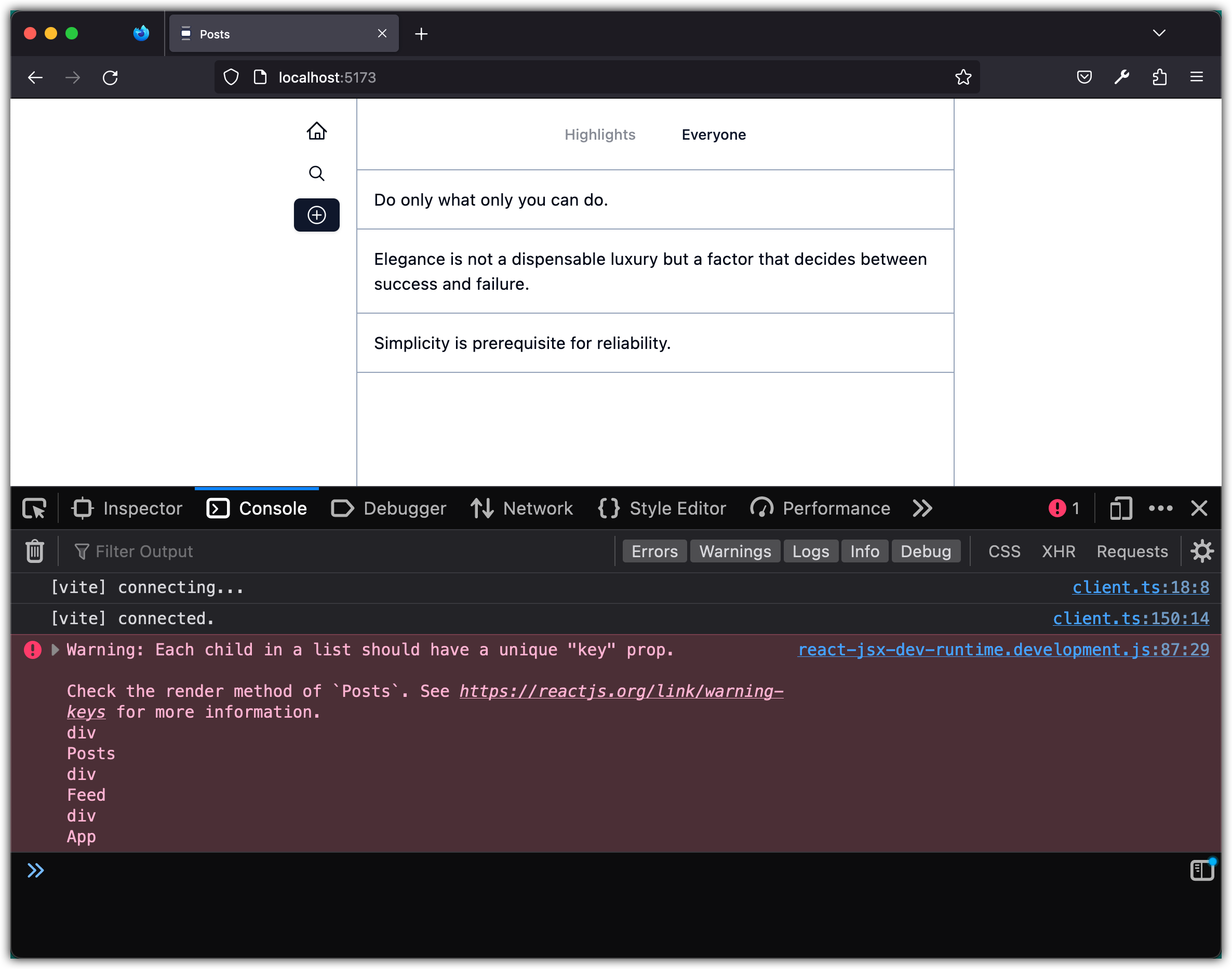
Notice the warning about “Each child in a list should have a unique ‘key’ prop.”
Each child in a list in React should have a unique key prop. The key prop is used by React to efficiently update and manipulate the list of components. When a component is added, removed, or reordered in a list, React uses the key prop to determine which component corresponds to which element in the list.
If a key prop is not provided or if multiple components in the list have the same key, React may encounter difficulties in identifying and updating the correct components. This can lead to unexpected behavior, such as incorrect rendering or loss of component state.
Let’s fix the warning! Update Posts component as follows:
- <div className="p-4 border-b border-slate-400">
+ <div className="p-4 border-b border-slate-400" key={post.id}>
    {post.content}
  </div>
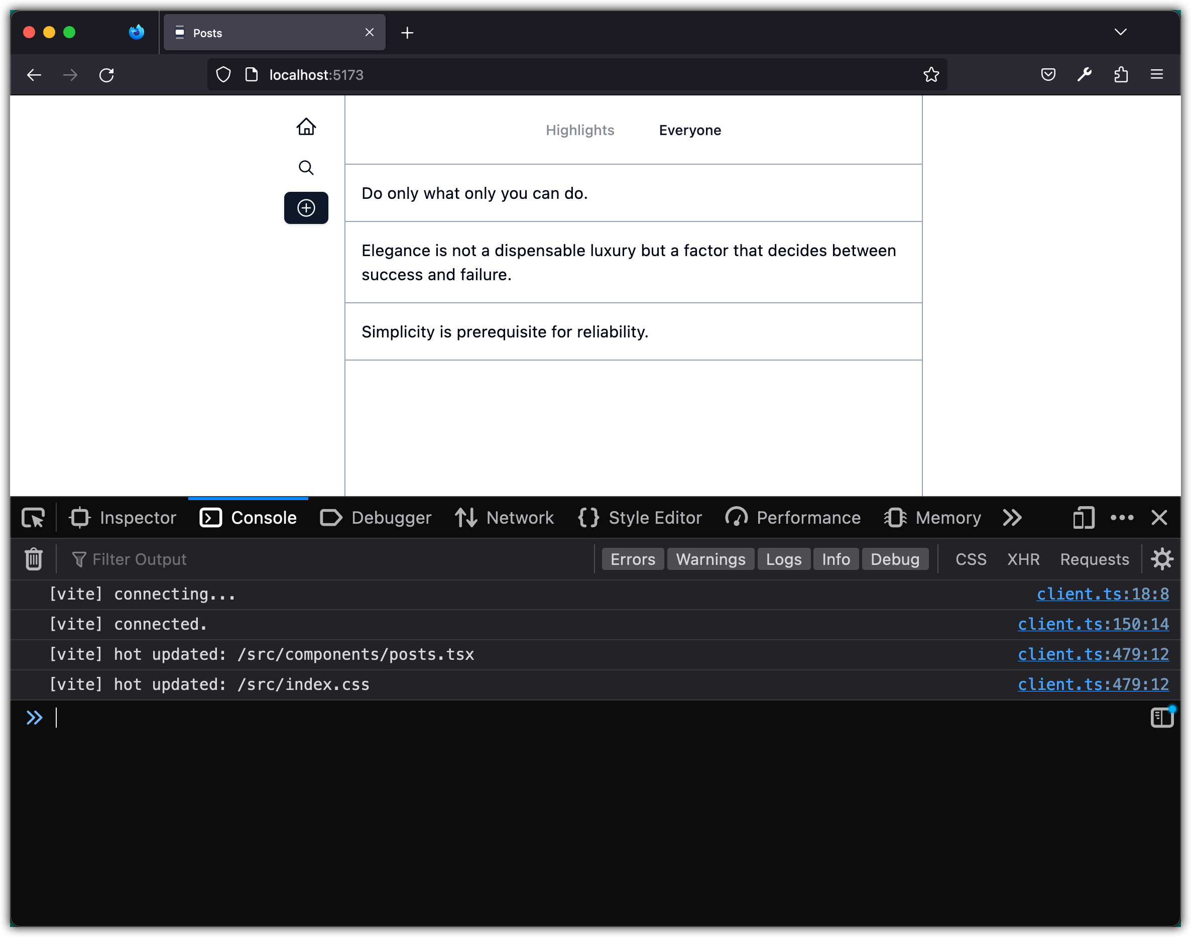
Refresh the app; the warning should be gone.

Let’s add a separate component for each post with placeholder for other UI elements such as like button, etc.
Create a new file src/components/post.tsx with the following content:
import { Post as PostType } from "@/lib/data";

type PostProps = {
  post: PostType;
};

const Post = (props: PostProps) => {
  const { post } = props;
  return <div className="p-4 border-b-2 border-slate-400">{post.content}</div>;
};

export default Post;
Update Posts component as follows:
import { posts } from "@/lib/data";
import Post from "./post";

const Posts = () => {
  return (
    <div className="">
      {posts.map((post) => (
        <Post post={post} key={post.id} />
      ))}
    </div>
  );
};

export default Posts;
Notice the Post component takes a props argument. In React, props (short for properties) are a way to pass data from a parent component to its child component. Props allow components to be reusable and customizable.
The parent component can provide values for props when rendering the child component. The child component can access these values through its props object.
For example, in the code snippet provided, the Post component accepts a post prop, which represents a single post. This prop is passed from the Posts component when rendering the Post component.
Inside the Post component, the value of the post prop can be accessed using props.post. This allows the Post component to display the content of the post dynamically.
Props are read-only, meaning that the child component should not modify the values of its props. Instead, props should be used to configure the behavior and appearance of the child component.
Note below is a slightly different implementation of the Post component:
import type { Post as PostType } from "@/lib/data";

const Post = ({ post }: { post: PostType }) => {
  return <div className="p-4 border-b border-slate-400">{post.content}</div>;
};

export default Post;
Let's break down the differences between the two code snippets:
-
Import Statement:
-
First Code:
import { Post as PostType } from "@/lib/data"; -
Second Code:
import type { Post as PostType } from "@/lib/data";
The difference here is the usage of the
typekeyword during import in the second code. This ensures that only the type information is imported, and not any actual values or logic. In the context of TypeScript, this distinction matters primarily for ensuring cleaner and more optimal JavaScript output when transpiling, as type-only imports won't generate any JS code. -
-
Type Definition for Props:
-
First Code:
type PostProps = { post: PostType; }; const Post = (props: PostProps) => { const { post } = props; -
Second Code:
const Post = ({ post }: { post: PostType }) => {
In the first code, there's an explicit type definition
PostPropsfor the component props and the props are deconstructed inside the component body. In the second code, the type definition is inline with the component's argument definition, and deconstruction is done directly in the argument list. -
Finally, notice with this refactoring the app should look and behave as before.
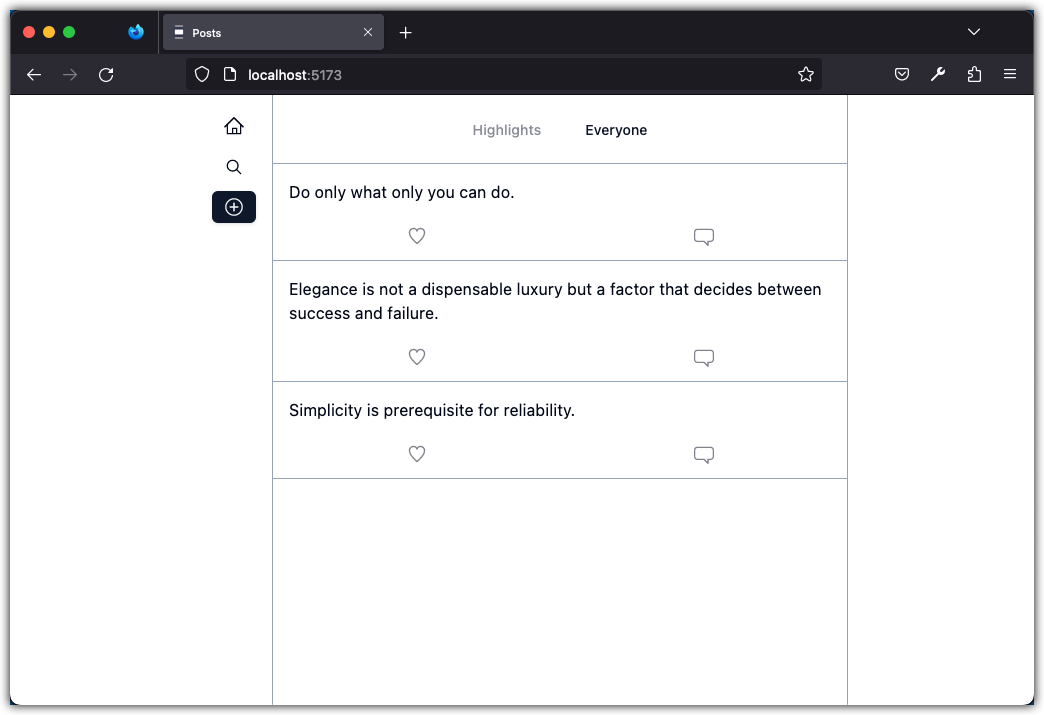
Let’s update the Post and add placeholder for various UI elements we will need on a post.
import type { Post as PostType } from "@/lib/data";
import { HeartIcon, ChatBubbleIcon } from "@radix-ui/react-icons";
import { Button } from "./ui/button";

const Post = ({ post }: { post: PostType }) => {
  return (
    <div className="border-b border-slate-400">
      <div className="p-4">{post.content}</div>
      <div className="flex justify-around mb-2">
        <Button variant="ghost" size="sm">
          <HeartIcon className="w-5 h-5 opacity-50" />
        </Button>
        <Button variant="ghost" size="sm">
          <ChatBubbleIcon className="w-5 h-5 opacity-50" />
        </Button>
      </div>
    </div>
  );
};

export default Post;
Check the UI
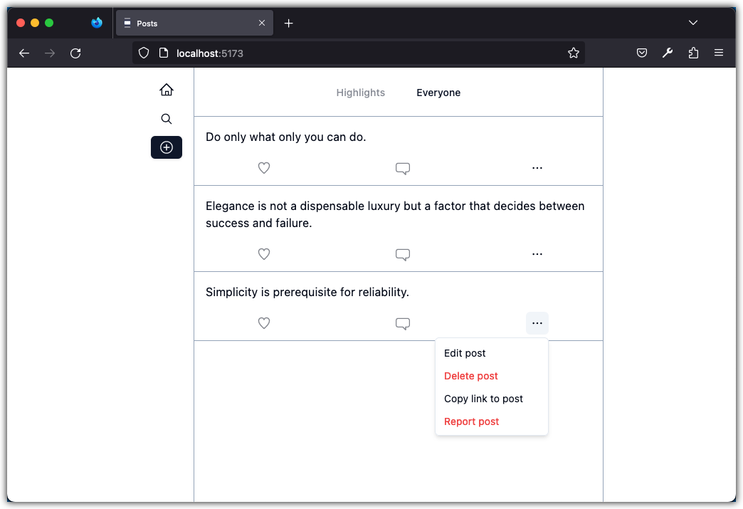
Let’s add a menu item for action on a post: edit, delete, share, report, etc. First, install dropdown-menu component from schadcn-ui:
pnpm dlx shadcn-ui@latest add dropdown-menu
Next add the file src/components/post-actions.tsx with the following content:
import { DotsHorizontalIcon } from "@radix-ui/react-icons";

import { Button } from "@/components/ui/button";
import {
  DropdownMenu,
  DropdownMenuContent,
  DropdownMenuItem,
  DropdownMenuTrigger,
} from "@/components/ui/dropdown-menu";

const PostActions = () => {
  return (
    <DropdownMenu>
      <DropdownMenuTrigger asChild>
        <Button
          variant="ghost"
          className="flex h-8 w-8 p-0 data-[state=open]:bg-muted"
        >
          <DotsHorizontalIcon className="w-4 h-4" />
          <span className="sr-only">Open menu</span>
        </Button>
      </DropdownMenuTrigger>
      <DropdownMenuContent align="end" className="w-[160px]">
        <DropdownMenuItem>Edit post</DropdownMenuItem>
        <DropdownMenuItem className="text-red-500">
          Delete post
        </DropdownMenuItem>
        <DropdownMenuItem>Copy link to post</DropdownMenuItem>
        <DropdownMenuItem className="text-red-500">
          Report post
        </DropdownMenuItem>
      </DropdownMenuContent>
    </DropdownMenu>
  );
};

export default PostActions;
Add the PostActions component to the Post component:
  <div className="border-b border-slate-400">
    <div className="p-4">{post.content}</div>
    <div className="flex justify-around mb-2">
      <Button variant="ghost" size="sm">
        <HeartIcon className="w-5 h-5 opacity-50" />
      </Button>
      <Button variant="ghost" size="sm">
        <ChatBubbleIcon className="w-5 h-5 opacity-50" />
      </Button>
+     <PostActions />
    </div>
  </div>
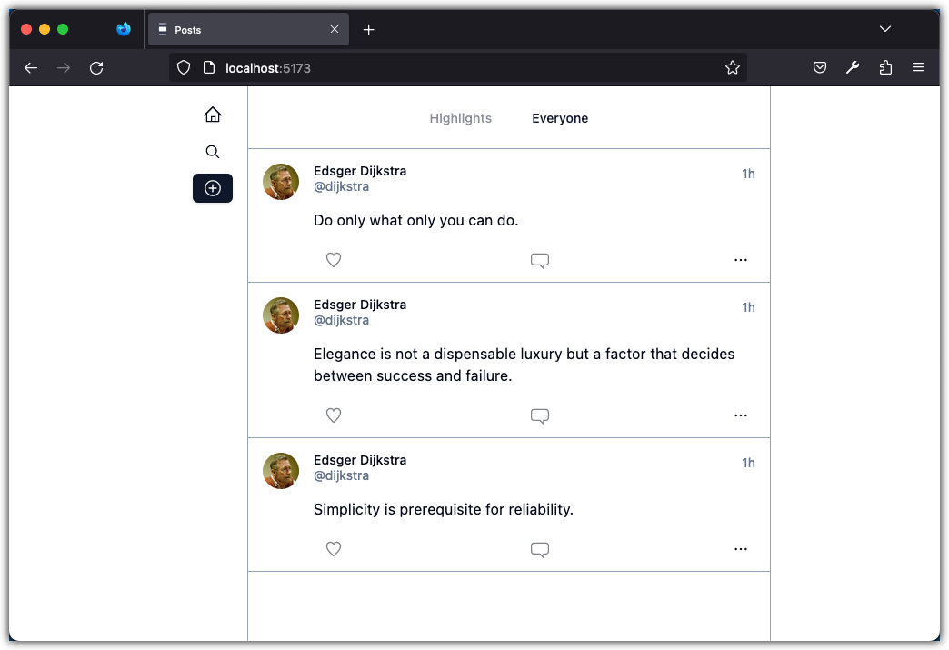
Check the UI:
Let’s add a post header component to show the avatar and name of the user who posted it. First, install avatar component from schadcn-ui:
pnpm dlx shadcn-ui@latest add avatar
Next, add a file src/components/post-avatar.tsx with the following content:
import { Avatar, AvatarFallback, AvatarImage } from "@/components/ui/avatar";

function PostAvatar() {
  return (
    <Avatar>
      <AvatarImage src="https://ieeecs-media.computer.org/wp-media/2018/04/02170212/edsger-dijkstra-e1528238724590.jpg" />
      <AvatarFallback>ED</AvatarFallback>
    </Avatar>
  );
}

export default PostAvatar;
Next, add a file src/components/post-header.tsx with the following content:
const PostHeader = () => {
  return (
    <div className="flex justify-between">
      <div>
        <p className="text-sm font-medium leading-none">Edsger Dijkstra</p>
        <p className="text-sm text-muted-foreground">@dijkstra</p>
      </div>
      <p className="text-sm text-muted-foreground">1h</p>
    </div>
  );
};

export default PostHeader;
Next, add a file src/components/post-footer.tsx with the following content:
import { Button } from "@/components/ui/button";
import { ChatBubbleIcon, HeartIcon } from "@radix-ui/react-icons";
import PostActions from "./post-actions";

function PostFooter() {
  return (
    <div className="flex justify-between mb-2">
      <Button variant="ghost" size="sm">
        <HeartIcon className="w-5 h-5 opacity-50" />
      </Button>
      <Button variant="ghost" size="sm">
        <ChatBubbleIcon className="w-5 h-5 opacity-50" />
      </Button>
      <PostActions />
    </div>
  );
}

export default PostFooter;
Finally, update the Post component as follows:
import type { Post as PostType } from "@/lib/data";
import PostAvatar from "./post-avatar";
import PostHeader from "./post-header";
import PostFooter from "./post-footer";

const Post = ({ post }: { post: PostType }) => {
  return (
    <div className="flex border-b border-slate-400">
      <div className="p-4">
        <PostAvatar />
      </div>
      <div className="w-full pt-4 pr-4">
        <PostHeader />
        <div className="my-4">{post.content}</div>
        <PostFooter />
      </div>
    </div>
  );
};

export default Post;
Notice we have hardcoded some data in the application and we will correct this in next steps.
Check the UI
Stage and commit all changes:
git add .
git commit -m "Display Posts"